Tuesday, July 27, 2010

June HCCC

This blog post is waaaaaaaaay overdue, but better late than never :)

The June HCCC was certainly challenging. I decided to make a card of encouragement for a student at my school that is currently undergoing treatment for leukemia.

Here's a look at the finished product:


I really wanted the orange ribbon to pop (since orange is the ribbon colour for leukemia), so I kept the background as neutral as possible, complimenting the orange with some light purple cardstock.


Part of the challenge forced us to make a card that wasn't a standard 5 1/2 x 4 1/4 single fold card. I wasn't getting inspired by any unique folding techniques, so I opted to make a simple postcard.


I have always wanted a stamp set with an Eiffel Tower in it, and recently picked up a Tim Holtz set on sale at Michael's. I couldn't think of a more suitable use for it than this postcard of encouragement.


I hope that the recipient can find a measure of comfort in this small token, and pray that the treatment grants the student strength and restores them to good health.

Monday, June 21, 2010

Summer Daze

I was
super excited
to get my
KOM from Unity Stamp Co.
for June.

I couldn't wait to use one of the stamps from the kit
to make this
AWESOME CARD:


I was inspired by
this card
that was posted on the Unity blog a while back.

i LOVE the end result.
It is happy, sunshine-y, summer!

Sunday, June 13, 2010

Dutch Treat


So, this weekend the FIFA World Cup began in South Africa and I thought I would pay homage to this event by creating a card that is influenced by the team that could win it all.... The Netherlands! Really I was looking for inspiration for this week's Mojo Monday challenge (see sketch on right), and it gave me an excuse to use my awesome "Netherlands" stamp set from Stampin' UP!


So, what did I end up creating? Take a look for yourself:

I don't think it is a winner (this one and this one are definite contenders), but it was fun to play along. My favourite part of the card is the little Dutch boy and girl. I embossed them, and then cut them out and popped them up on the card. I am also very fond of the burgandy cardstock in the background. I ripped the cardstock to give it a "rustic" feel, and the colour really pops on top of the subtle patterned paper.
Hope you like it, and I hope to have some new creations posted soon!

Sunday, June 06, 2010

Mother's Day - A month later...

June is a busy month for birthdays in my family, so I will have lots of opportunity to get crafty in the next few weeks.

However, today I thought I would FINALLY post the card that I created for my Mom for Mother's day.

Here's a look at the finished product:


There are various aspects of the card that I really love. But, if I had to do it all over again, I would get rid of the brown/pink polka-dot ribbon in the centre. Ugh. Too many different patterns.

I'm really happy with the two flower embellishments that I created using my flower punch and brads. I also really love the stitching that I did around the bottom half of the card. Take a look at a close-up:


Also, for this card, I got to use my brand new tag punches that I purchased from Stampin' UP!. Love these punches! I've got vague ideas of using them to create some awesome Christmas cards. Here's another look at the "Mom" tag:


Overall, the finished result is okay. And, even if I'm not 100% over the moon about it, my Mom really liked it, so that's all that matters :).
Stay Crafty!

Sunday, May 30, 2010

Lemon Zinger

So, with a week to go, I've finally got my card for the HCCC completed. Nothing like waiting 'til the last minute! :)

Here's a close-up of my paper-pieRcing. I pierced the corners of the yellow cardstock that is layered under my stamped images.


The layout for my completed card was taken from an old Mojo Monday sketch (I was feeling extremely un-creative and could not for the life of me think of a layout of my own).


I really enjoy the yellow/grey/white colour combo. I glued some 'dazzling diamond' sparkles on the stamped images, layered them on the yellow cardstock and the popped them up with some dimensionals.

Super cool. Way fun. Can't wait for next month's challenge!

Friday, May 14, 2010

Blog Candy

What an amazing way to celebrate a birthday - giving unto others. Hopefully whoever wins all of Debbie's blog candy will use it to bless others.

Friday, May 07, 2010

Mojo Monday 137 Challenge

Happy Weekend Everyone!

I decided to try my hand at another Mojo Monday challenge. I really liked the layout for this week (see picture on the right) and I was inspired right away. However, it actually took me three nights to pull all of the elements together and complete the card.

I thought the panel of 4 squares was an interesting design element. Right away I was inspired to create a "film strip" type of feature for this section and incorporate it into the card.

Here's a look at the finished product:


My spin on a non-traditional Christmas card. I don't like using traditional Christmas colours, and thought the colour combo in this patterned paper was so great. And I really love how the "film strip" panel turned out.

Awesome!

I tried to find a square punch that I could use to make life a little easier, but I couldn't find one, so I cut out all of the squares by hand with my paper trimmer, and then punched holes down the sides. Love the finished result!


The 'merry' and 'Xmas' are heat embossed in white so that they pop on the cardstock.


These three flower brads kinda faded into the background, so I thought if I glued some sparkles on them, they might 'pop' a bit more on the card.

Overall, I really like this card. Love the colours. Love the layout. LOVE the film strip feature. What do you think?

Monday, May 03, 2010

Birthday Celebrations

I had the opportunity to make some cards with Angela this weekend, and I needed to make a card for my father's birthday.

Two birds, one stone.

This is the end result of 3 hours on the road, 2 beers and a couple hours of stamping fun:

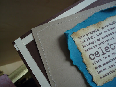
Pretty nice, huh? Hindsight being 20/20, I think I would have tilted the kraft cardstock layer in the other direction to balance the angle that that stamped 'celebrate' image is tilted.

Still love it though. It was my first time sewing, and it turned out pretty well for a first try. Woohoo!

Here's a close up of the layers:


I had a blast creating this card. Will probably have to make a few more using this design.

Cardstock: Chocolate Chip, Kraft, Taken with Teal, Very Vanilla (SU)
Ink: Chocolate Chip (SU)
Stamp: 'Celebrate' (SU)

Thursday, April 15, 2010

April HCCC

So, this month's challenge over at the HCCC was a doozy! Ange sure knows how to issue them.

My inspiration for this month's challenge was this picture frame that I received as a gift for my birthday:

Nice, huh? Yeah, I really like it too :) Gotta find the perfect pic to put in it.

So, I tried to play on the circles around the outside of the frame, and incorporate that into my card. Here's a look at the finished product:

This is a sweet little card that I am going to use for my niece's baptism next month.

My favourite features of the card:
- I got to use transparencies
- The face of the card slides open to reveal the 'inside'

See what I mean:

Too cool.
Here's a close up look at the "pearl"-esque embellishments...

Can't wait for next month!

Thursday, April 08, 2010

MOJO133 Madness

I had some extra time this week, so I thought I would take the opportunity to challenge myself. I decided to take a stab at the Mojo Monday challenge:

I really liked the challenge layout for this week and couldn't wait to get crafty!

And, here is my take on the original:

I tried to stay away from using purple (since it is my go-to colour) and really challenge myself by using some other colours. :) I heat embossed the jukebox image with my awesome, sparkly, stardust embossing powder. The 'bday' sentiment is also embossed on the blue CS using white embossing powder to make it pop out.

I like the music theme of the card, but think that the patterned paper in the background might be a bit too busy. I am pleased with the end result though. Hope the recipient likes it as well!

Sunday, April 04, 2010

Masculine

My attempt with this card was to create a masculine birthday card. I have to make a lot of birthday cards for my many brothers and nephews, and I have a hard time coming up with new ideas. I mean, in the end the guys aren't going to really care about the time and effort that went into the card - it'll just end up in the recycle bin - but I want to know that I've put my best effort into the creation. ;)

The layout for this card is based on a card that I received months ago from my friend Angela.

I made a mask of the ticket stamp, and used it to created the layered ticket look. I then wrote "Happy Birthday" inside the tickets. I popped the tickets up with dimensionals on top of some patterned paper.


The first flap opens up to reveal another fold of patterned paper...


...which in turn opens up to reveal the inside of the card where I can write my birthday greeting:


Overall, I think its ok. Not too frilly or frou-frou-y. Dark colours. Very masculine.

Monday, March 29, 2010

Happy Birthday to Me!

So, March is the month of my birthday and in celebration I issued a challenge over at the HCCC to celebrate. Here's a look at the card I submitted for the challenge.

I had a lot of fun working with the 3" x 6" card size. Think I'm going to start using this size a little more often. The flowers in the lower right-hand corner of the card are embossed in dark green, the butterfly is done using two-step stamping, and the flight path of the butterfly is enhanced with some green "bling". I'm quite happy with the end result.

Wednesday, March 03, 2010

Love/Hate Relationship

The card I am posting today is a thank-you card I made for my sister-in-law's Bridal shower. I have a love/hate relationship with this card. Most of the time, when I look at it, I hate it. Crazy colours, too wild and busy. Blah!

The other half of the time, I love this card. I think it's genius! I love how the green and the purple tie-in with the colours on the patterned paper. And I love how the circles punched out on the purple cardstock match the circles on the patterned paper.

What I really want to know, is what do you think? Do you hate it, love it, or are you indifferent to it?

Tuesday, February 23, 2010

February Hits & Misses

Greetings fellow bloggers!!

I've missed a few blog posts this month 'cause I was on VACATION!!!

Sorry to leave you all behind, but I'm going to make it up to you by posting three different cards today. Angela's challenge for February over at the HCCC was a doozy this month. Really challenging. So challenging that I ended up creating four different designs, not quite happy with any of the results. The designs seemed great in my head, but the execution left a lot to be desired.

Here's the first card I came up with:


I really like this card, and I think out of the four designs it is my favourite, but I didn't submit it for the challenge. I like the stamps and the colours, I just find the end result to be quite overpowering. I thought "I can do better than this!" and I went back to the drawing board.

In my second attempt, I tried to incorporate the wrapping paper that was the inspiration for the colour choice:

It's okay.... not great. And I thought that by using the wrapping paper, I was cheating, so I started over and tried again.

My third attempt was fun. I got to use the guitar and "Rock On" stamps from Unity that I have been dying to use ever since I picked them up from the mailbox:

I liked it as well. The whole design is popped up off of the base using dimensionals, and I embossed the "Rock On" (love embossing!). I also put a few staples on the card to give it that 'rock' edge.

If you want to see the card I submitted for the challenge, head on over the HCCC blog and let me know what you think.

Sunday, January 31, 2010

Wedded Bliss

The card I chose to post this week is the card I made this past summer for my brother Matt's wedding.

The wedding colour was pink (with brown accents). I wanted to incorporate these colours into the card. I had seen a card on SCS earlier in the year where the stamper had weaved ribbon on the front of her card as an embellishment. I had been itching to try it out on a card, and decided this was the card.


Card Details:
Stamps: God's Promises & Sanded (SU!)
Cardstock: Winter White, Pretty in Pink & Chocolate Chip (SU!)
Embellishments: Chocolate Chip ribbon (SU!), Dazzling Diamonds sparkles (SU!)

Sunday, January 24, 2010

January Hazzard County Challenge


This week the card I am posting is the result of a card challenge I recently issued to my friend Angela. We are starting our own monthly card challenge. We have been dubbed the 'Duke Design Divas' and we have founded the Hazzard County Card Challenge.

January's challenge was to use the January 10th card design in the Paper Crafts "Card-A-Day" book entitled 'Bambino', designed by Melissa Phillips. We also had to use one stamp from Unity Stamp Company's December KOM and at least one button.

This challenge was interesting for me. I am a very impatient person, so when I make cards I tend to skip embellishments. I just want to finish the card so that I can give it away to someone. But due to the challenge I was forced to at least add a button, and I managed to even add some hemp-string and some stitching! This is my completed card:

This is probably one of the most "complete" cards I have ever made.

I recently started adding hand-stitching to my cards, which you can see in the top left and bottom right corners.

I popped up the flower and placed my button in the centre with a linen thread bow.

My tag in the bottom right hand corner is actually the result of a stamping accident. I had wanted to stamp the words directly onto the patterned paper, but I didn't place it properly. So, I decided to cover it up with a piece of cardstock instead! I distressed the edges, and added some more linen thread to tie it in with the rest of the card.
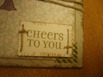
I was trying to be extra creative with the card challenge, so I did some stamping on the inside of the card, as seen here:
I hope you like this card. If it wasn't for the card challenge this month, I'm not sure if I would have found the time to get any stamping done this month!

Sunday, January 17, 2010

Sunflowers

I was recently organizing the pictures on my computer and I came across this card that I made last year. It's an oldie, but a goodie!


When I began making this card, I was sure I was going to hate it. But I had a ton of fun colouring in the flowers, and I was really happy with the finished product. It's simple, yet sweet. I used the retired Stampin' Up set Provencal, and my bold brights cardstock to make the flowers pop.

It has always been one of my favourite creations.

Saturday, January 09, 2010

Creative Outlet

So, I've decided to start blogging the cards that I make using my Stampin' Up and Unity stamps. I love how this hobby allows me to be creative. I get to brighten the lives of my friends and family by sending them cards for special occasions or "just because".

I'm going to start by showing you the first card that I ever made using my new Stampin' Up products.

For this card I used my Sweet Shapes stamp set from Stampin' Up and the Pixie Pink and Gable Green cardstock from the Bold Brights colour set. I had fun making this card, so I made five others which were variations on the same theme. They are a nice card that I can pull out and use for a variety of occasions.

I am going to start small with this blog and post something new every week ... stay tuned. I'd love to hear what you think, so feel free to leave a comment.